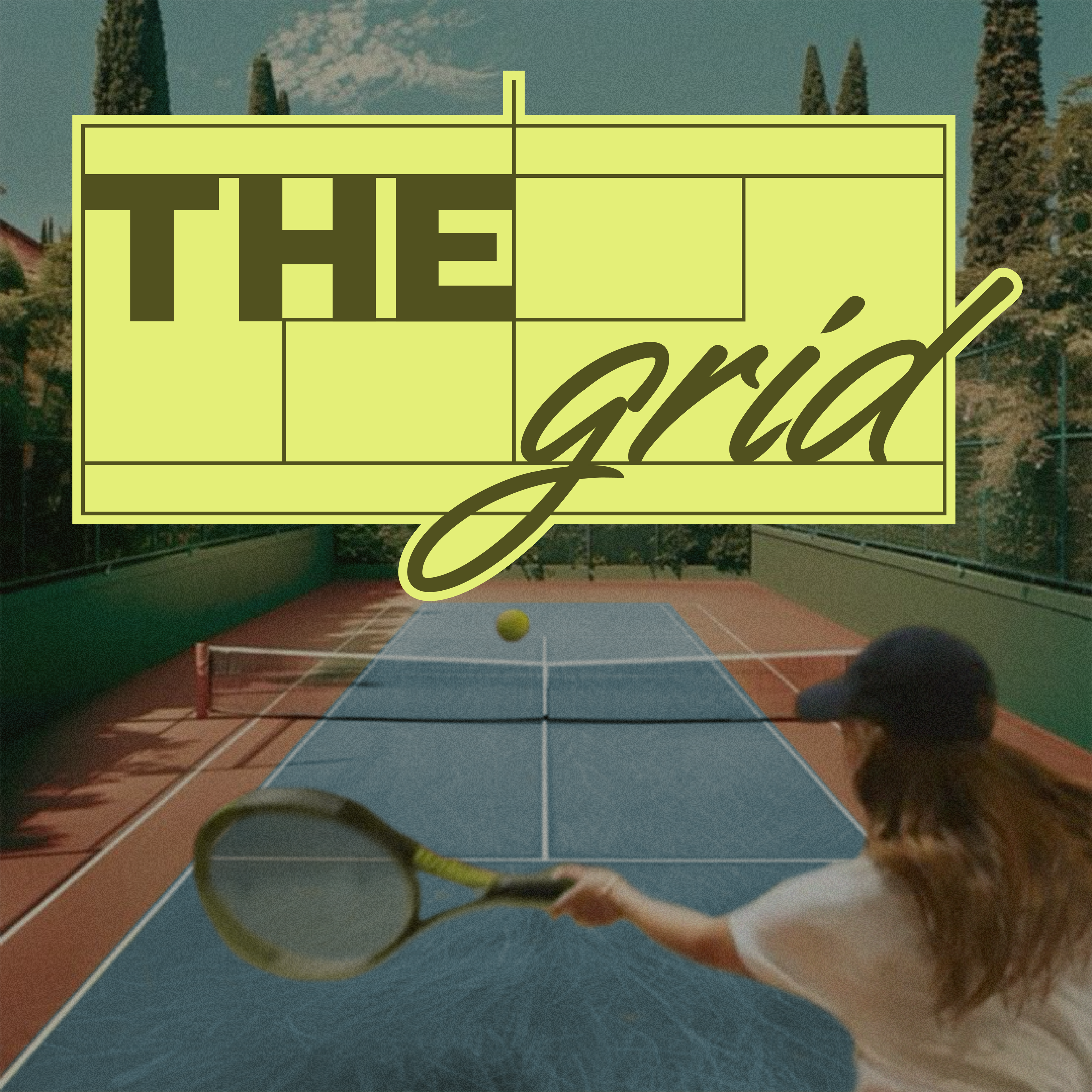
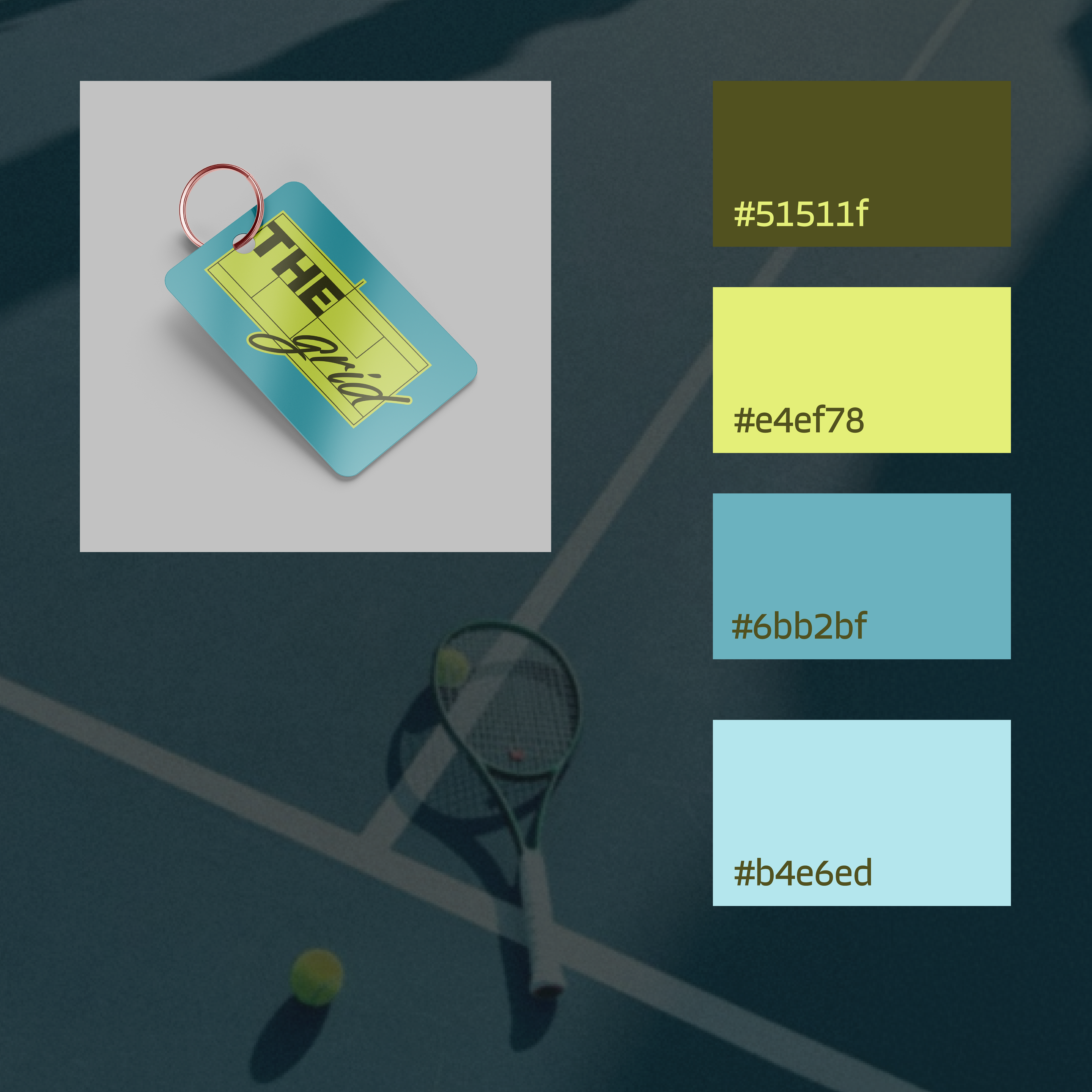
My take on the following design brief, "The Grid is a modern tennis club built for players who love the game and the energy that comes with it. With a bold and stylish vibe, it's the place to train, compete, and connect. The Grid makes tennis feel fresh and exciting".
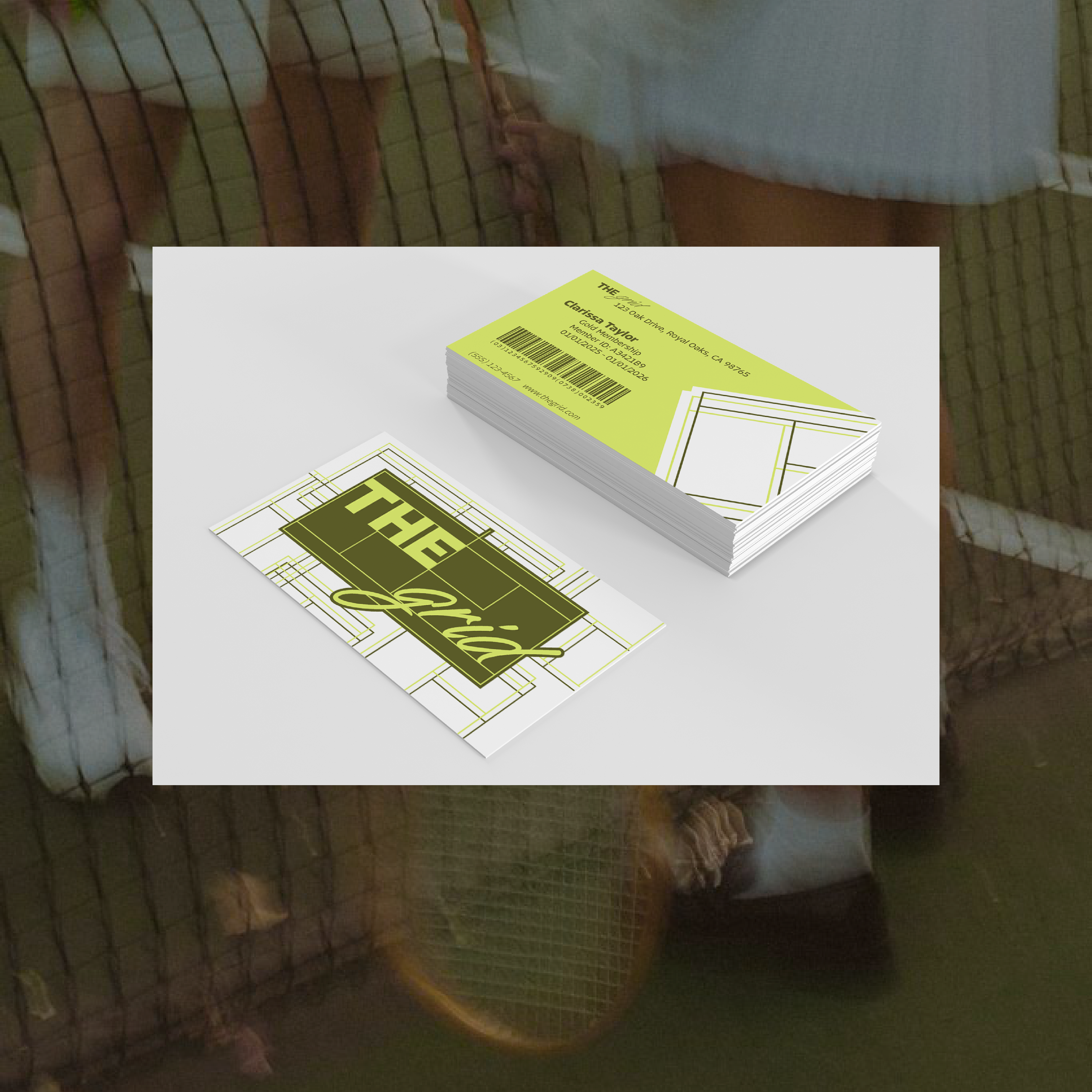
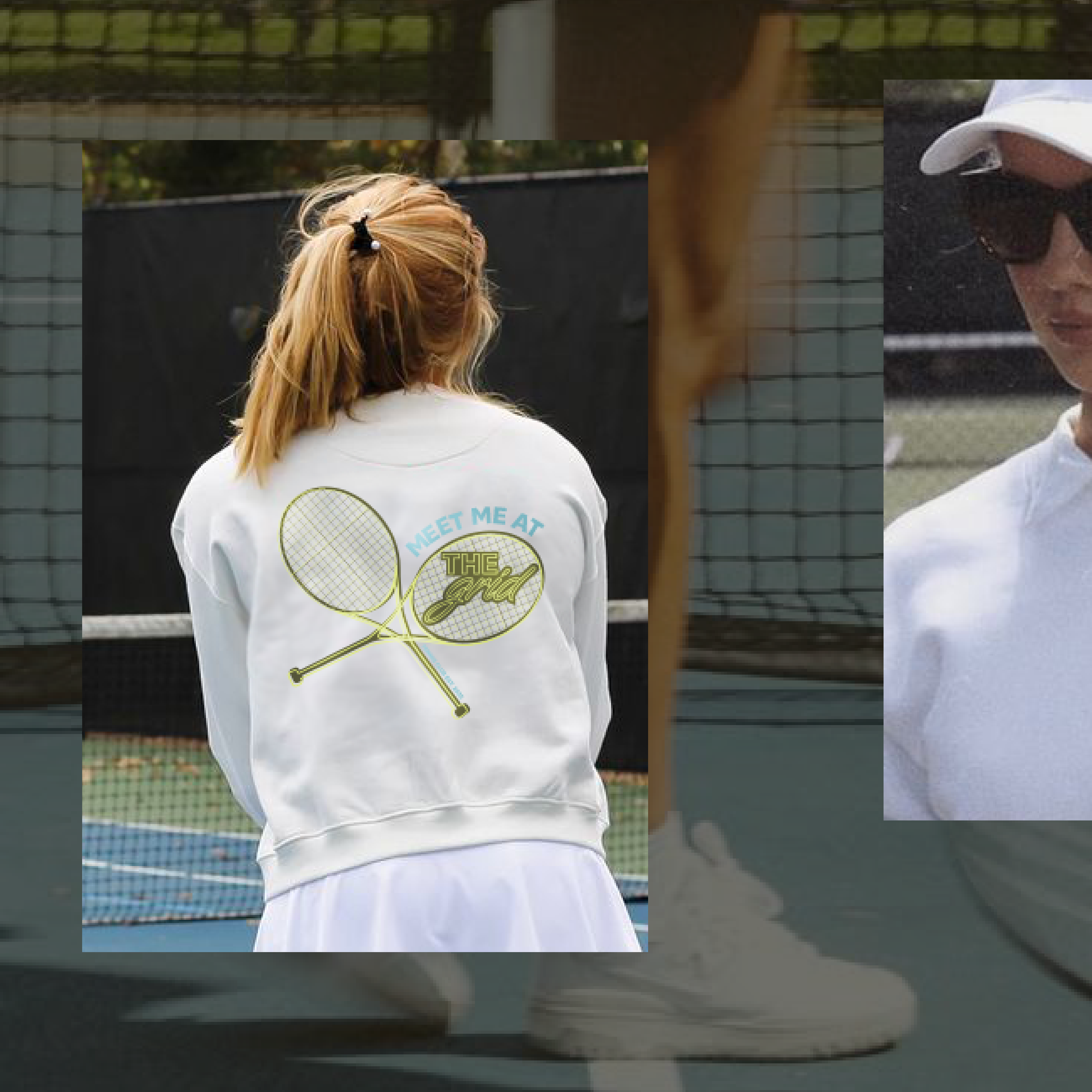
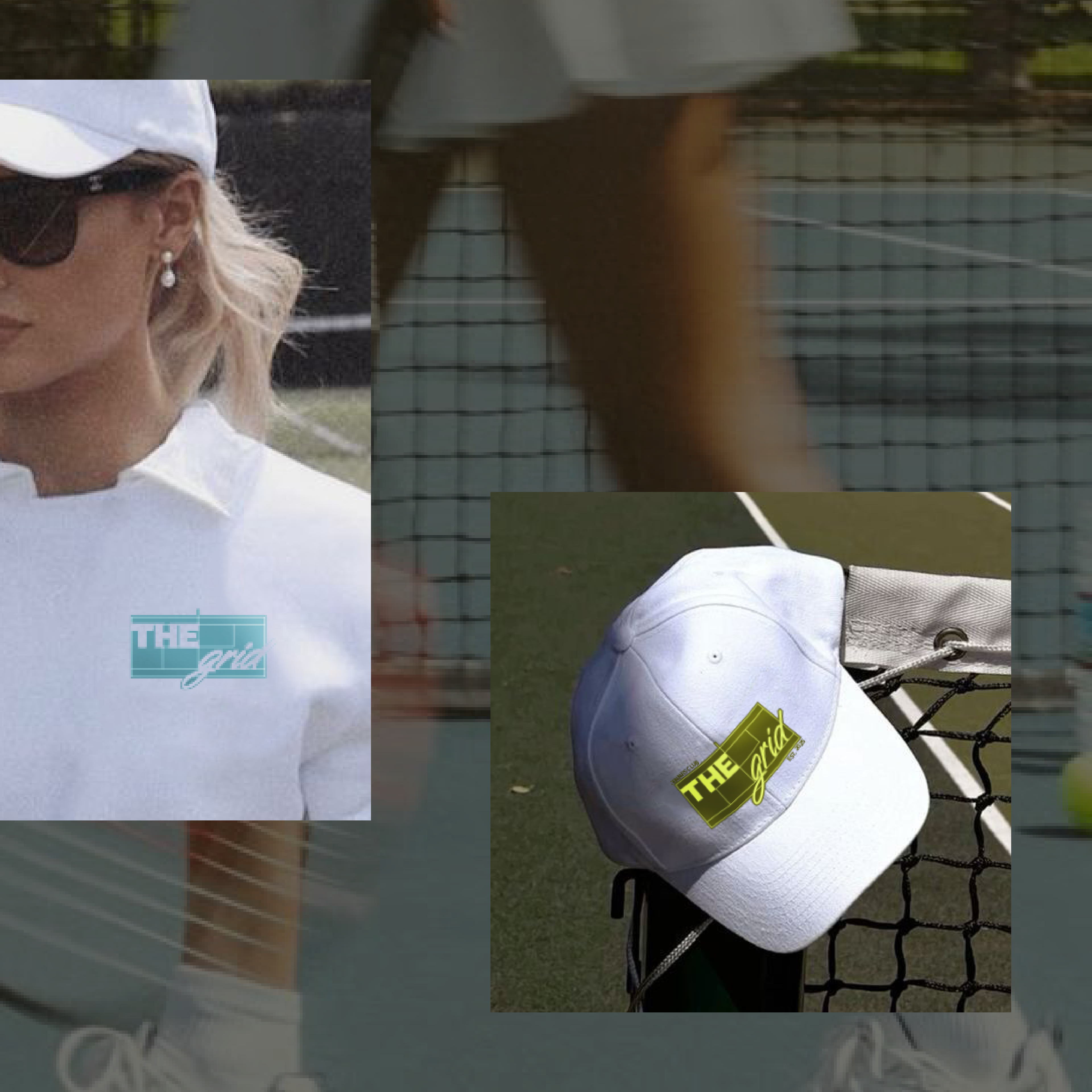
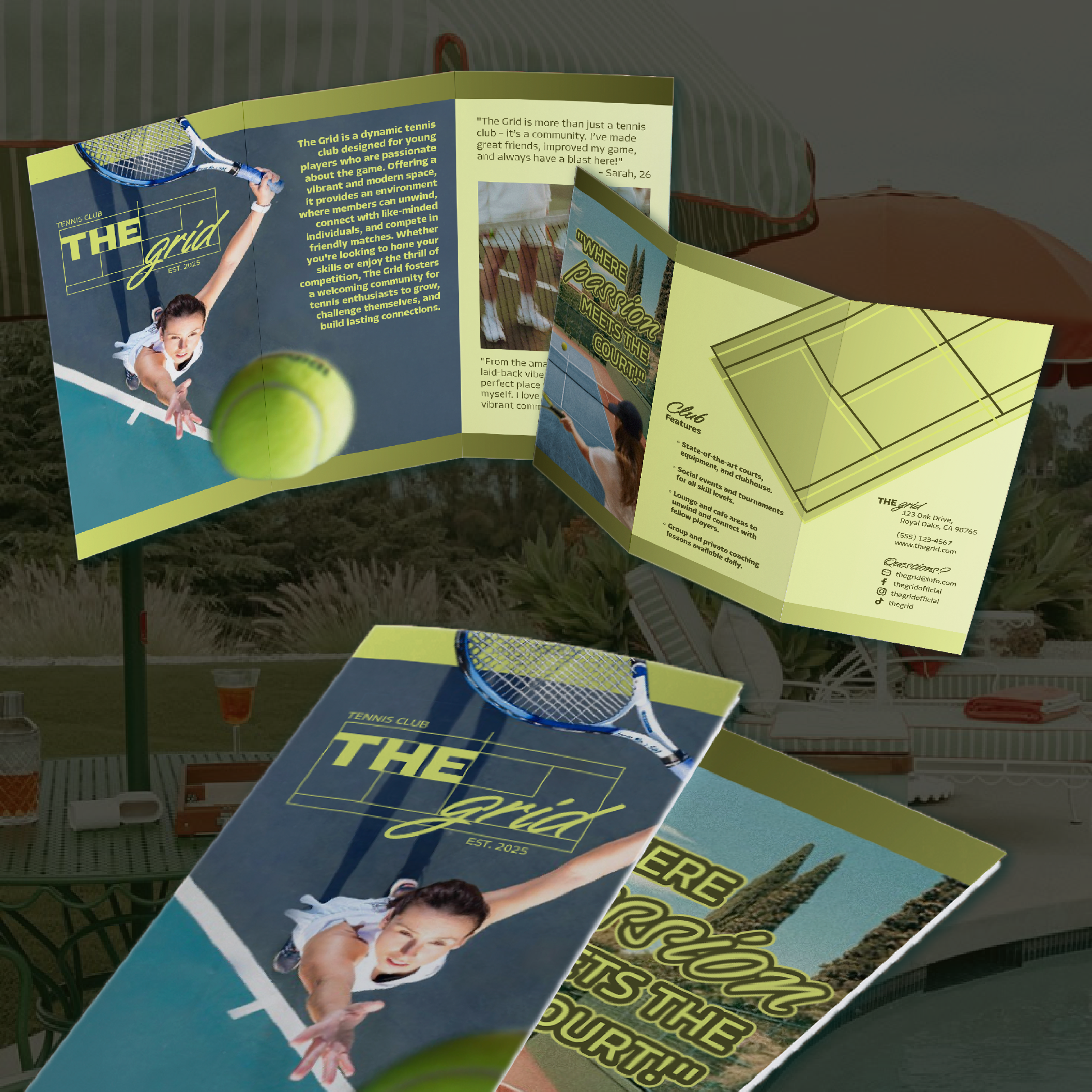
I decided to highlight a few key marketing components for a new club of this nature including, of course, the companies logo. But, I also created a fob to access the club, along with full size membership cards, brochures, and some fabulous merchandise available exclusively for club members.
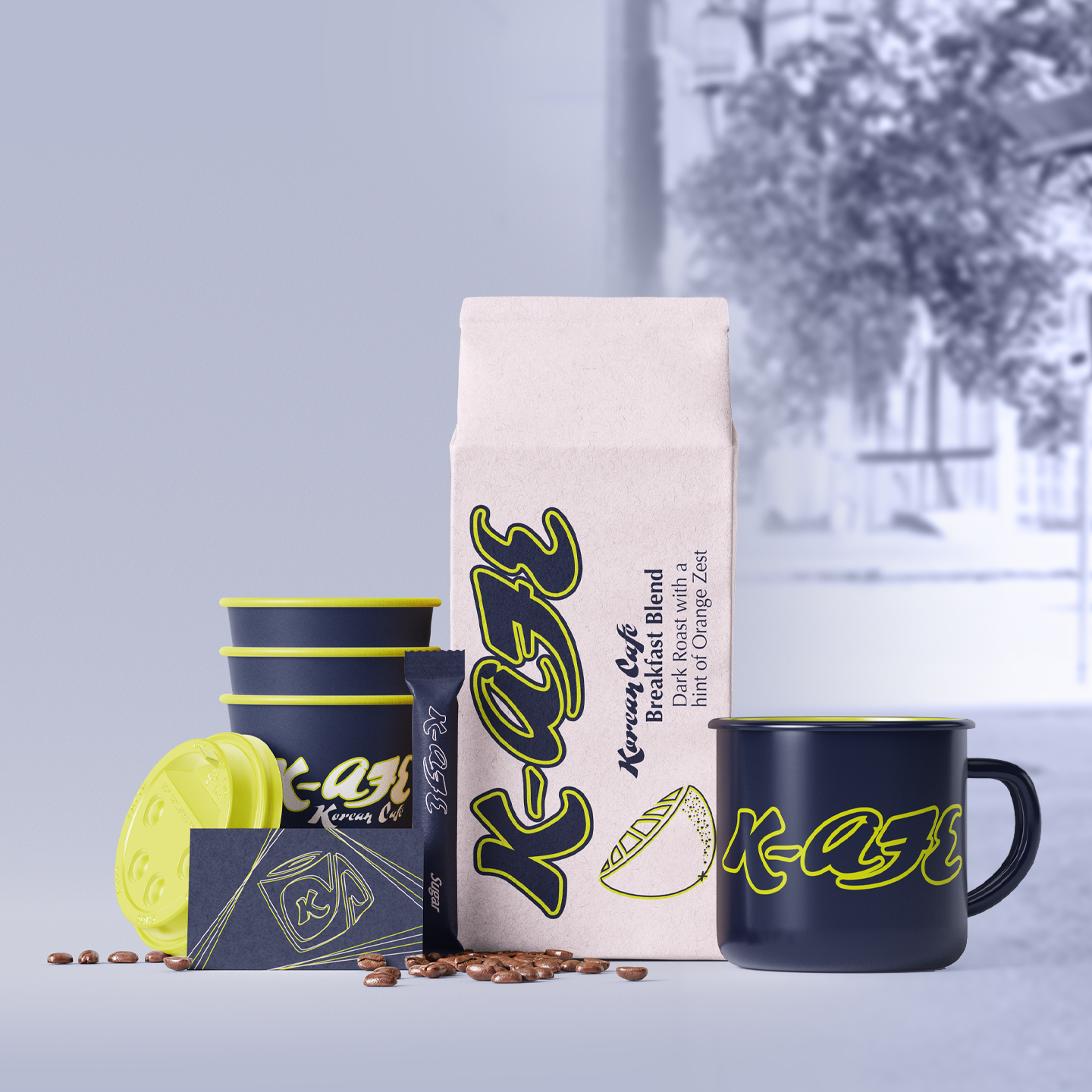
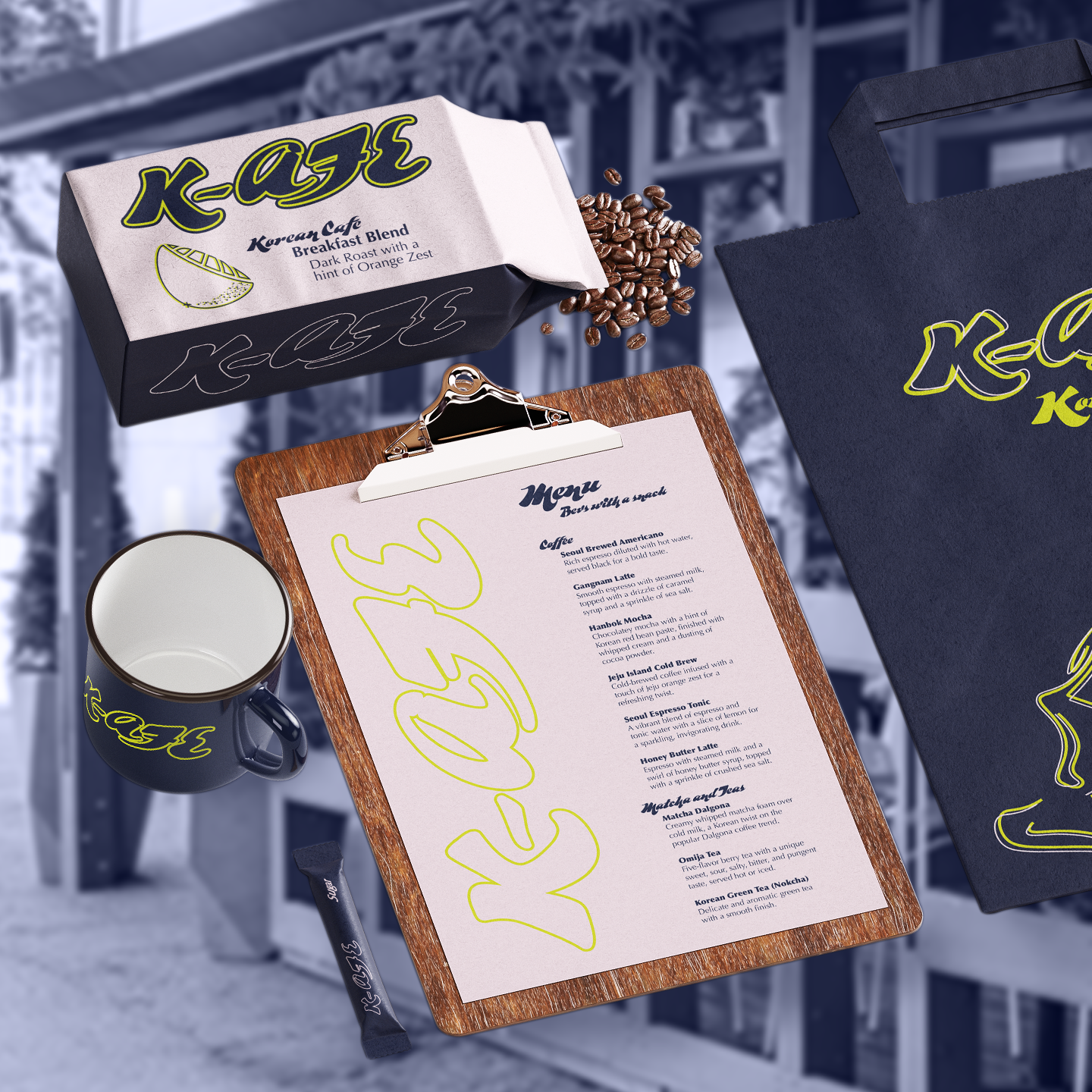
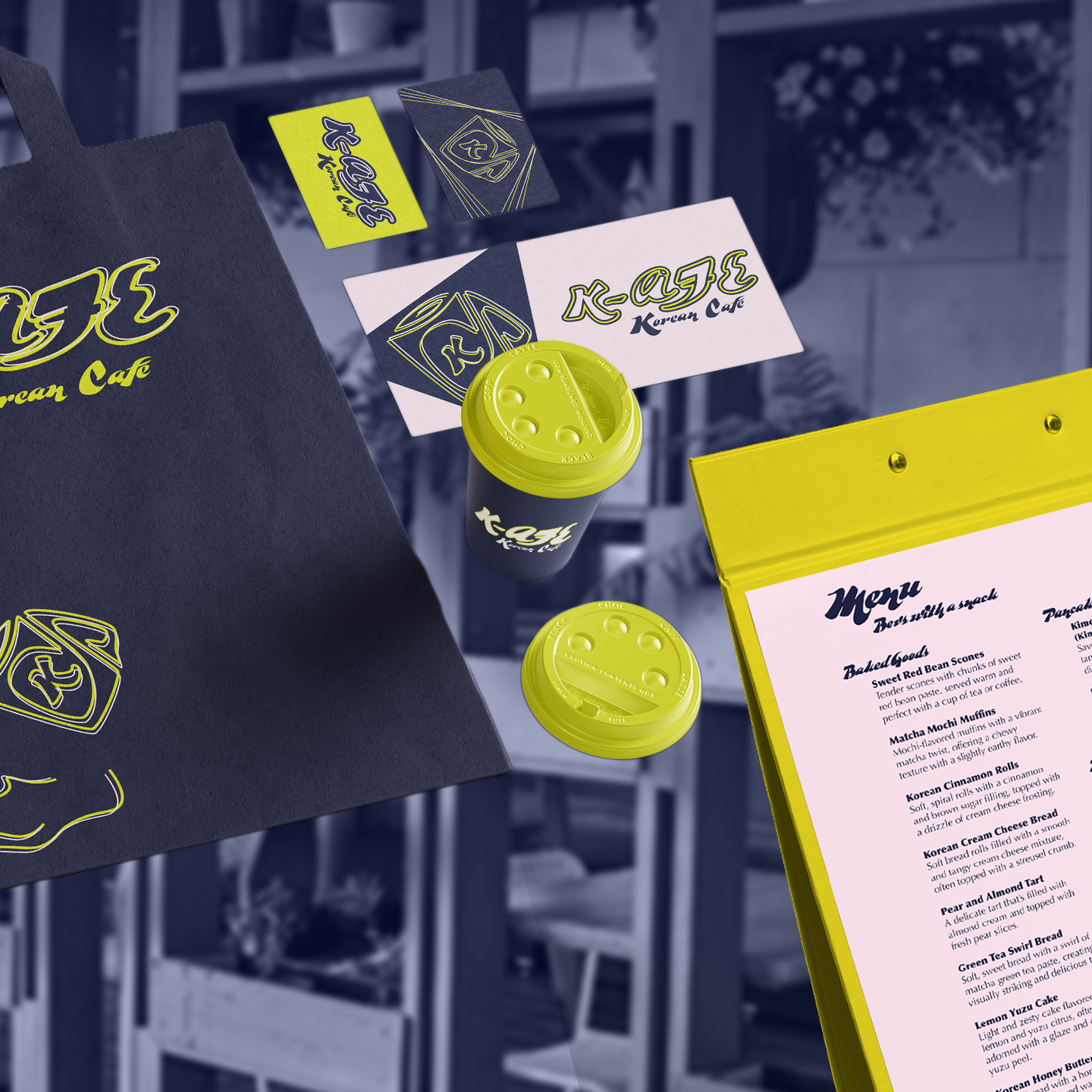
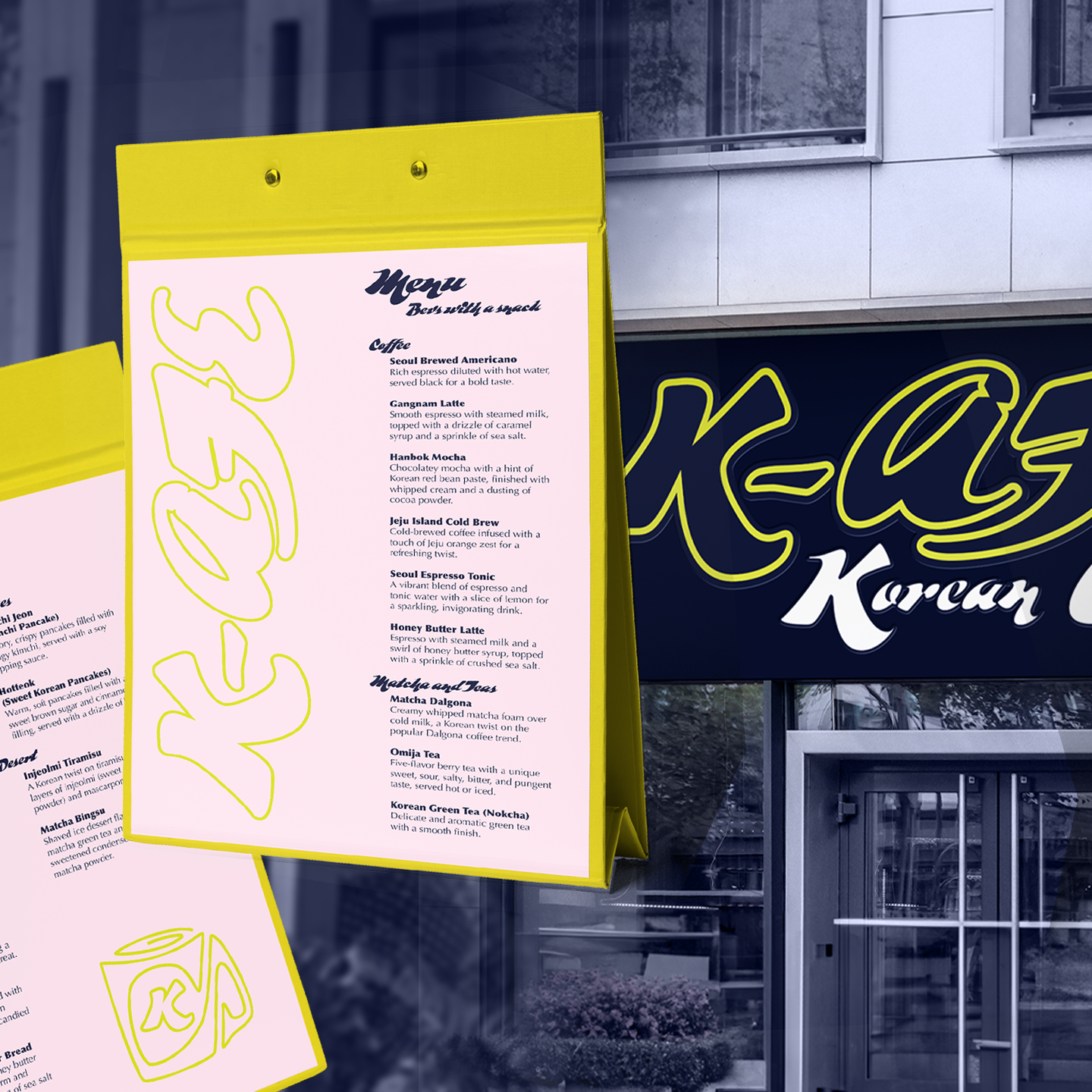
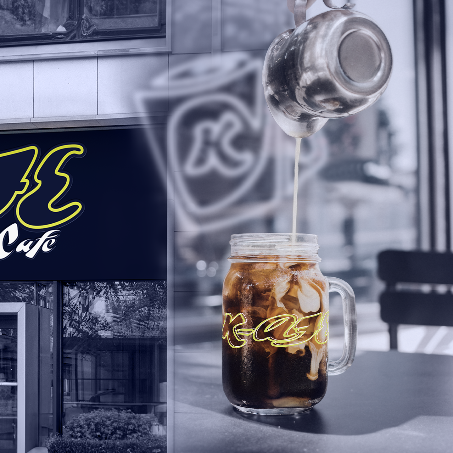
My take on the following design brief, "K-afe is a Korean cafe that offers a wide range of traditional and modern Korean beverages and snacks in a modern and inviting atmosphere making it a perfect spot for coffee and foodies."
I chose purple and green as my primary branding colors to represent some of the unique flavors often found in Korean sweets, purple sweet potato and matcha, which may by offered at the K-afe. Key elements I opted to display include the coffee cups both for purchase and cafe use, along with menus, coffee packaging and a few other fun twists!
